
They could have removed those cancer causing rubber pellets eh bro.Originally Posted by ByeSonBusiness


 Senior Member
Bisonville Hall of Fame
Senior Member
Bisonville Hall of Fame


They could have removed those cancer causing rubber pellets eh bro.
Lardsin must go!
 Senior Member
Bisonville Hall of Fame
Senior Member
Bisonville Hall of Fame
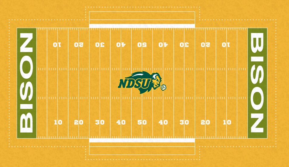
They could have a wider sideline and then had something like "North Dakota State University" where the sideline is just narrow now. Alternating shades of green every 5 or 10 yards is also kind of cool IMHO. I'm also a fan of having the "G" just outside the goal line where the numbers are painted every 10 yards.
It's OK to not be OK.
 Senior Member
Gets their mail at the West Parking Lot
Senior Member
Gets their mail at the West Parking Lot
Just like Boise and EWU they could've done the main body of the field in a school col.... nevermind.
 Senior Member
Gets their mail at the West Parking Lot
Senior Member
Gets their mail at the West Parking Lot
Pretending that every single field looks identical in everyway only proves that you need to see a doctor immediately. lol. honestly, call an ambulance
1. The FCS was the Best option for NDSU for a very long time.
2. As a general rule- the FCS sucks at football and has proven that is not committed to football at all.
3. It's time to go FBS
 Senior Member
Bisonville Hall of Fame
Senior Member
Bisonville Hall of Fame
"Live from the Scream Yellow Gate City Bank Field at the Fargome..."
Everyone would love this design!!! No complaints whatsoever!
You can have some fun of your own at: https://www.shawsportsturf.com/resou...d-design-tool/
Senior Member
Gets their mail at the West Parking Lot
Just to show you how dense you comment is, here is a list of customizations that you could make on your multi million dollar turf that you will see on television for the next 10 years:
Base color of the turf.
Logo- Could use any one of the 4-5 that NDSU has
Logo Size- I could have definitely gone bigger, some choose smaller (YSU)
Font
Endzone style- solid, striped, checkerboard etc
Endzone font
Endzone logos
Endzone Color
Conference Logo patches
Adding or subtracting sponsor names on the field
secondary logos near the 20 yd line
Script near the benches
Alternating field colors 5-10yd lins
Script behind the endzones
Script by the tunnel
With these variables there are literally thousands upon thousands of different possible variations. But not according to our AD. There was only one choice- no other options existed. It is impossible that a better version exists- just ask ML! He knows better than all of us about everything, just ask him!
1. The FCS was the Best option for NDSU for a very long time.
2. As a general rule- the FCS sucks at football and has proven that is not committed to football at all.
3. It's time to go FBS
Senior Member
Gets their mail at the West Parking Lot
field otpion 1.JPG
Just an Idea at an alternate logo - whatcha think?
1. The FCS was the Best option for NDSU for a very long time.
2. As a general rule- the FCS sucks at football and has proven that is not committed to football at all.
3. It's time to go FBS
 Senior Member
Bisonville Hall of Fame
Senior Member
Bisonville Hall of Fame
He did not ask what could be changed...but what could be improved, and what was lacking. I think they did a pretty good job. Many of the things you mentioned would make it worse...just my opinion. I don't really care for the alternating colors every 5 yards. I like the endzones...like the choice of logo at midfield...sure...could have been a little bigger, but just fine how it is. I hate SDSU's checkerboard endzones...very glad they did what they did.
And then changing the color of the turf. What choice would we have besides green or yellow? I think the yellow would get old/annoying very quickly for even those that might like it. And one sponsor name on the field is plenty.
Notorious--Bisonville all-time POTY
Proud member of TOHBTC[/B]
Senior Member
Gets their mail at the West Parking Lot
We should be the first school with fiber optic turf. We could have more turf combinations than Oregon had uni combos. No need for painted yard lines that get warped. The first down line could be actually on the field. The team intro would be epic! Talk about an elite GameDay experience!
Sent from my Pixel 4a using Tapatalk
 Senior Member
Bisonville Hall of Fame
Senior Member
Bisonville Hall of Fame
This conversation proves that no matter what things happen, people will complain. There ia nothing wrong with this turf design. I mean, what are you looking at during the game? The actual play on the field; or if there is a “G” at the goalline, or lettering that you cant see under the players feet at the benches, or wishing the logo was 5 feet bigger. Cant please anyone. Cant wait for beer in the dome and people will find a way to complain about the type of beer sold, what the beer glass looks like, and probably the hairstyle of the person selling the beer! Haha!!
"North Dakota State is a big part of the fabric of college football right now."
"North Dakota State is alive on the college football map."
-Lee Fitting ESPN
 Posting Permissions


 Reply With Quote